
Breeze Mobile
An inclusive redesign of Atlanta’s Transportation App
Situation: In an increasingly mobile-centric world, users need efficient and user-friendly mobile solutions.
Task: Breeze Mobile strives to offer seamless, intuitive mobile experiences for various applications.
Action: We've developed a range of mobile solutions, from apps to responsive web designs, focusing on user experience and functionality.
Result: Users can enjoy streamlined mobile interactions, whether for business, entertainment, or personal productivity, enhancing their digital lifestyle.
MARTA, the Metropolitan Atlanta Rapid Transit Authority, ranks as the 8th largest public transportation agency since its establishment in 1971, offering vital transit services via buses and trains to both locals and visitors. With a mission to promote safe and equitable transit, MARTA serves a diverse population, including the visually impaired, who represent a significant portion of the 62.1 million annual riders.
However, MARTA's mobile app, Breeze, currently poses accessibility challenges for users with visual impairments, particularly in navigating ticket purchasing due to complex submenus. Redesigning the app with a focus on inclusivity can streamline navigation and enhance accessibility, making MARTA's services more user-friendly for a broader audience.
To initiate the app redesign process, I conducted user testing of the existing app, gathering feedback on its various screens. Participants, both residents and non-residents of Atlanta, reviewed the app independently, without assistance. Their observations were recorded to identify prevalent issues and areas for improvement.


After user testing and research these were the goals that I sought after with my redesign
1. Simplify ticketing process: Goal is to streamline and clarify ticket purchasing for users.
2. Add live updates: Include arrival times for buses and trains in the app.
3. Redesign map: Enhance clarity of MARTA lines and stations for easier route exploration.
4. Revamp settings: Improve functionality and add useful features and options.
5. Visual update: Enhance text hierarchy and color contrast for improved readability.
6. Dark mode: Introduce higher contrast option for users with visual impairments.
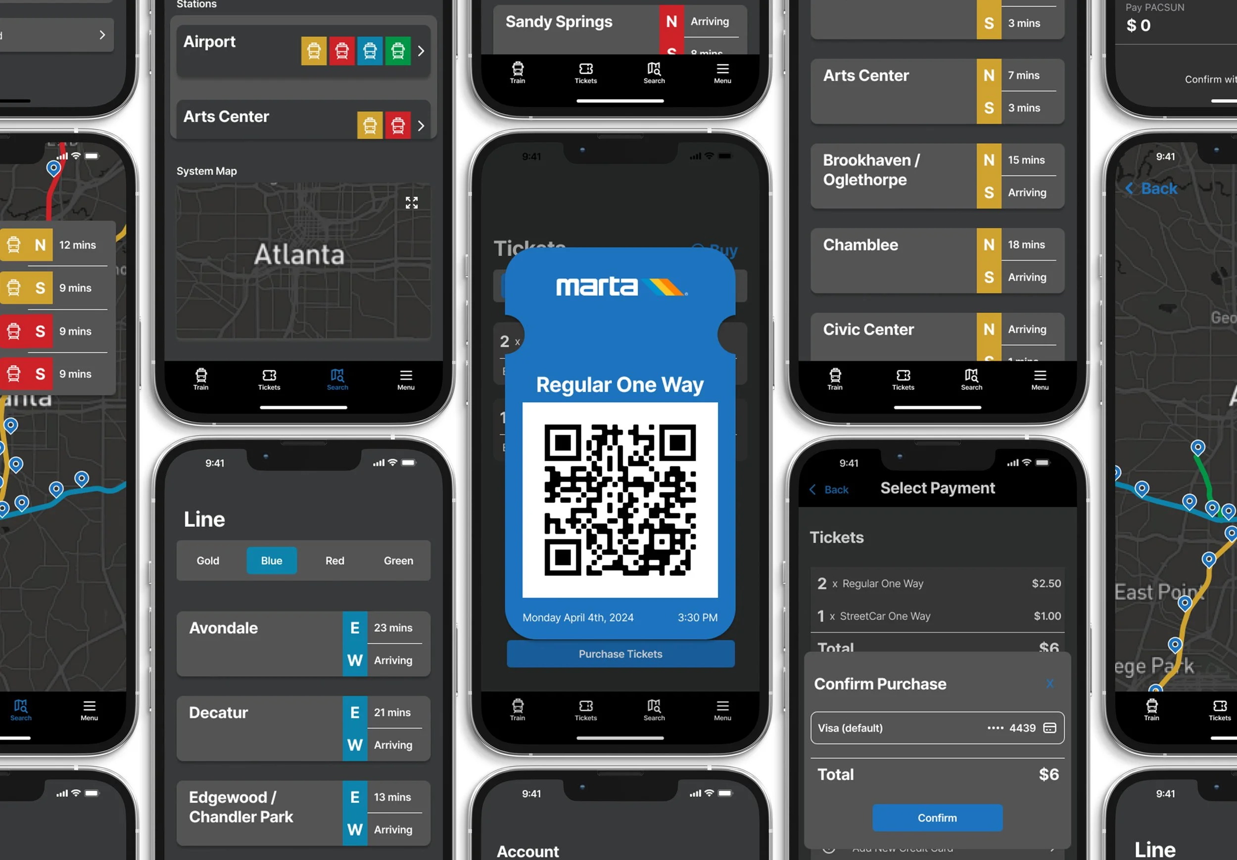
For ticketing, I streamlined the process, enabling quick addition of multiple tickets and simplified activation of the ticket screen. I also included additional instructions to guide users on how to use the ticket effectively.
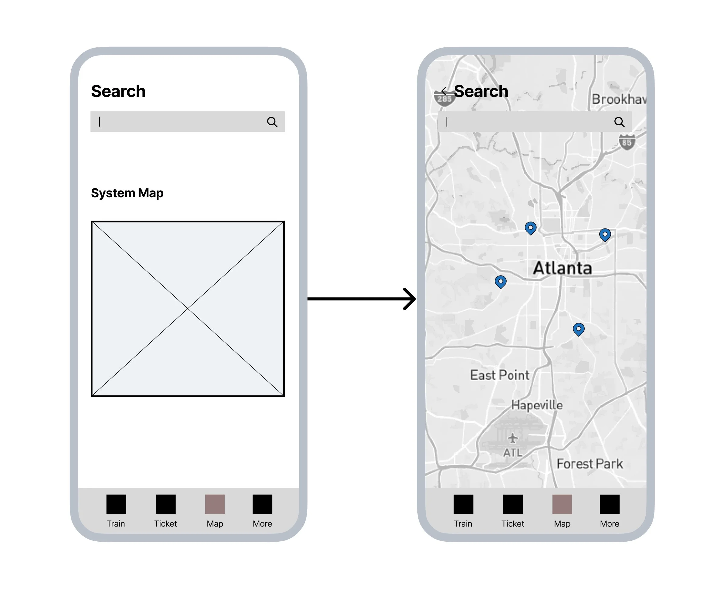
In the map section, users can easily see the system map and current stations, making it simple to view the rail lines.
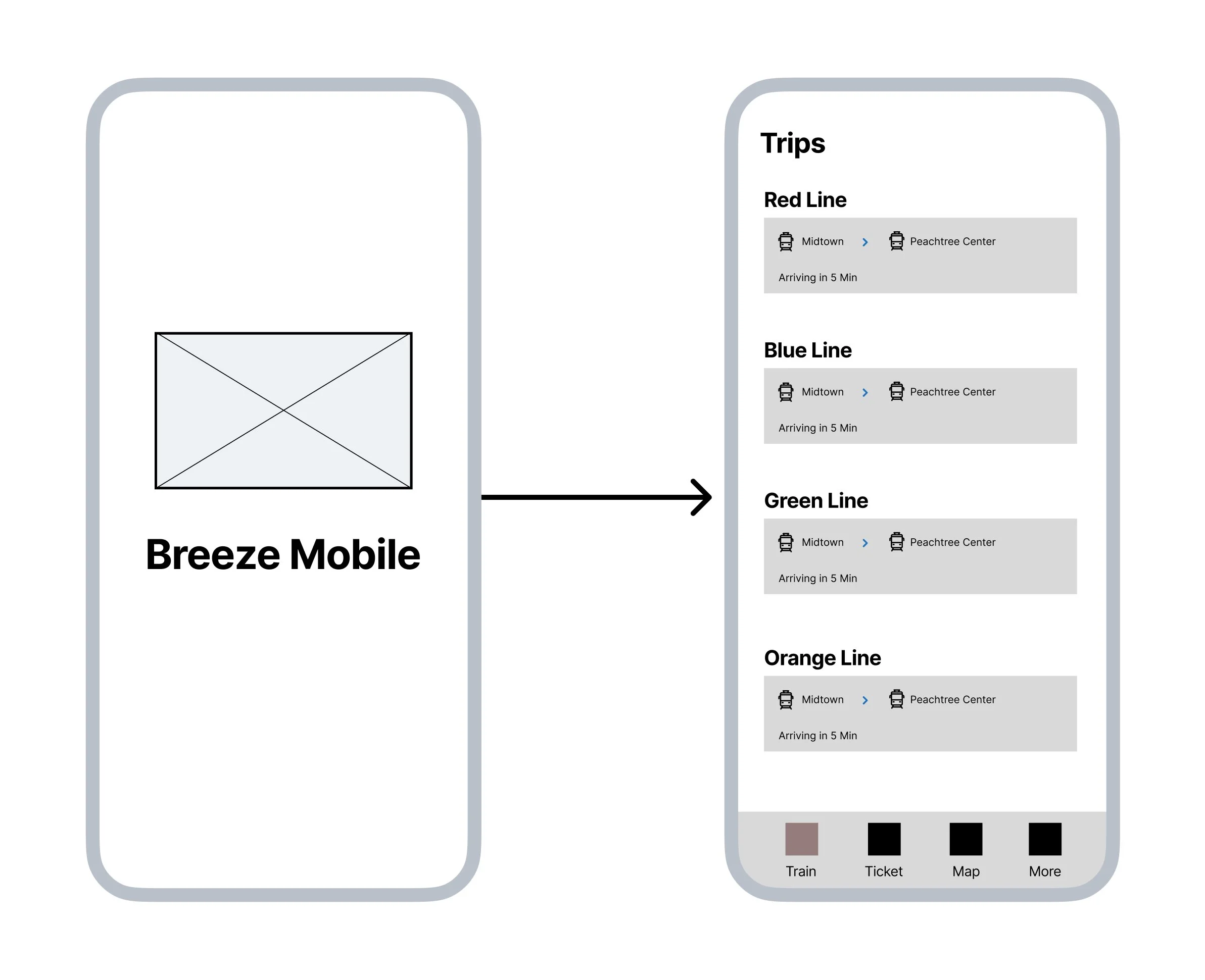
I imagined the home screen of the app displaying the current rail line, allowing users to quickly check the arrival times of trains.
In the settings, I envisioned offering a variety of usability options, including the choice to enable a dark mode for increased transparency and contrast.
With all this in mind I created my prototype with the features I wanted.
Here is the revised MARTA Breeze App

The feature changes are as follows:
Dark mode allows for higher contrast and easier visibility for those with impairments
Reflection:
At first, I underestimated the complexity of this project, focusing on updating MARTA's app after finding it difficult to use myself. Recognizing the potential challenges for users, especially those with visual impairments, I redesigned the MARTA Breeze App. Through diverse user testing, I gained valuable insights into user interface design and learned to consider the app's overall experience rather than just specific features.
Despite initial challenges, including neglecting certain aspects during wireframing and struggling with prototyping tools, I persevered and enhanced the app's functionality. This project has provided invaluable industry insights and opportunities for growth, preparing me for my career ahead. Although there's room for improvement, I'm proud of the app's representation of my current skills and eager for future opportunities.